

In a previous blog post in this SCOM Reporting blog post series I showed you an example of the Performance Detail report, where we went through selecting a time range, and made a series (graph) for a group of servers called Application XYZ Computers and we got the Processor Time % counter in there relevant for the report.
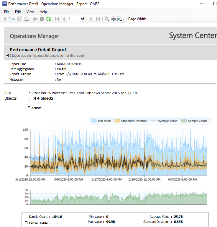
Let me show you the picture again:
There are a few reasons why I think this report is very useful.
If you know exactly which counters from which servers you need, so a very specific set, you can create performance reports per server or per counter per object.
However sometimes its needed to create graphs of several objects (servers, websites, databases, disks) at the same time. Such as an audit or capacity across all servers, or like the example I provided the performance of a group of servers for Application XYZ.
What makes the Performance Detail report useful in this is the statistical information around it. It is not simply a line (the black line in the graph in the figure above), but it also contains additional information. These are the minimum and maximum measures values and the Standard Deviation. When I look at a report of these 4 machines in one graph in the example above I quickly look at the average line first. So OK, 30% processor usage is good enough. However I do see in the graph immediately if the Blue and Yellow areas are very close to the average line or if they are further out. From the blue areas I can see that after the first week the blue area is bigger on the higher CPU side. From the blue area we see minimum values below 5% and near the top to 70-80%. That looks like at least 1 machine might not have so much to do and at lest 1 machine may have more to do in CPU. The blue area just shows the highest measured value across all machines for the time frame (which is an hourly data aggregation, based on performance measurements of I think 5 minutes apart in this case). The yellow area just shows you where the majority of the data points for that time period are located. If it close to the average line it means the blue entries far outside the line might be one-off’s.
SO looking at this graph as somebody interested in Application XYZ and its performance and capacity planning…. The first week in the graph CPU is between 0 and 40% with average at 20%. I do not have to check further. Looking at the 4 weeks after that I see the average creeping up a bit, but the highest values are consistently higher. I want to know which of the machines is causing this to happen. Meaning I can quickly see from this generic graph bundling several machines together if I am interested to know more, or if this is enough info for me.
Say I want to know more… and zoom into each of the 4 machines in my group for Application XYZ. There is a simple trick to it, that is pretty hidden.
Look right above the graph. There is a word “Actions” with a + plus sign next to it. Click the + sign.
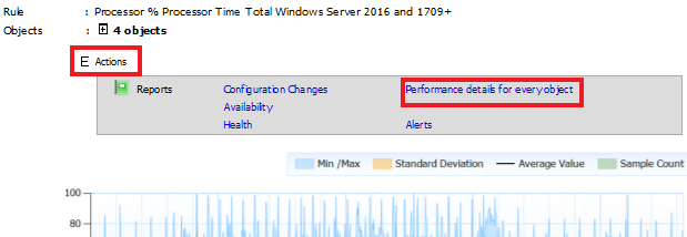
Here I opened it up with the Actions + sign and i get a sub-menu. Click the Performance details for every object option and it renders you the same graph for the same time period, but for each machine separately.
SO I now have a child report with 4 graphs and I can see what is going on.
- I have a machine sitting around 10% CPU being quite constant, so this one may account for the very low CPU entries. Is this machine scaled too high in resources? Might save some money here.
- I have a machine sitting at 10% CPU or so, but with regular (near exact) spikes to 80%. Looks like once per day. Could be a nightly job running there, maybe a backup or anti virus scan? Could be interesting to look at.
- I have another machine sitting between 0 and 10% CPU. Is this machine scaled too high in resources? Might save some money here.
- The last machine looks like the reason the graph changed from the first week. I sat at 40% CPU and went to 60% CPU average and later went down a little bit again near the end of the time period. But this one too has spikes once per day going up to 90% or more. So it looks like this machine has the highest load overall. Could be a candidate to throw more resources at. Also a candidate to investigate the daily spikes.
So just by looking at the main report I found a reason to zoom in. I zoomed in and found a few machines with different behaviour. As we expect with Application XYZ which might be built with a front-end and back-end structure. And I found some reasoning for conclusions relating to capacity management and reasons to ask a sys admin to investigate what is happening on the remaining machines.
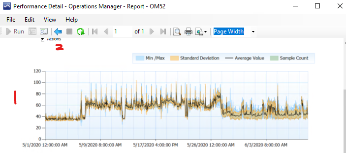
Here is a screenshot of that machine 4 in the list above.
I want to draw your attention also to the red number 1 in the figure. While quickly scrolling through the graphs in this child report you might get the wrong idea. This is because the scale on the Y-axis of the graph can change. In this case because it had values up to 100% it adjusted the scale to run from 0 to 120. But the other machine which had nothing to do has its scale running from 0 to 40. Because there is nothing more to show. But if that machine is running at 20% CPU in a graph that scales from 0 to 40% it looks like it is sitting at half the CPU. SO always look at the Y-axis in performance reports, because they will auto-scale to what is needed to render the picture. And in this case it is not always a pure 0 to 100% as you would expect.
Also when you are done zooming in for this child report you can click the blue back button in the menu above it indicated with the red 2 I put in the figure above.
The report Performance Detail is a very useful one for reporting across a larger number of instances and determining if it makes sense for you to zoom in and find an object which clearly stands out from the group and potentially needs your attention. I can tell you it is very difficult otherwise to look through many graphs (each with different Y axis!) and look for an odd one out which might not be there. Now you know what to look for (or not), you could zoom into the child graphs and find the one you need to take action on.
This is why I feel this one is useful.
Back to the master list: SCOM Reporting series – Home and What is SCOM Reporting
Comments are closed.